About the MD Climate & Health Equity Mapper
Maryland Climate & Health Equity Mapper
The Maryland Park Equity Mapper application combines demographic and environmental health data from a variety of sources and maps that data onto Maryland census block groups in order to identify disparities in public climate and health equity. This application allows users to evaluate these factors in their community and see how it compares to the rest of Maryland. The Climate and Health Equity Mapper can be used by city planners and public health officials to identify communities in need of infrastructure revitalization. Currently there are 8 categories of data.
- Climate & Health Equity Scores
- Natural Disaster Risk
- Health Infrastructure
- Health Outcomes
- Vulnerability
- Community Resilience
- Climate and Health Context Layers
- Help (this is the document you are currently reading)
Climate and Health Equity Score
Climate and Health Layers
| Climate & Health Equity Score | Each of the five factor layer scores were created by averaging all of its sublayers. The total score was calculated by averaging the 5 factor layer scores together equally weighted. |
|---|---|
| Natural Disaster Risk Score |
Layers in this list include: |
| Health Outcome Score |
Layers in this list include:
|
| Health Infrastructure Score |
Layers in this list include:
|
| Community Resilience Score | The Community Resilience Estimates are experimental estimates produced using information on individuals and households from various surveys and other data. In the mapper, the county level scores were applied to each census tract in the counties. |
| Vulnerability Score | The Vulnerability Score measures the social vulnerability of U.S. counties to environmental hazards. The score is a comparative metric that facilitates the examination of the differences in social vulnerability among counties. The Vulnerability Score also is useful as an indicator in determining the differential recovery from disasters using empirically-based information. |
Context Layers
These layers provide more information on assets and liabilities that are specifically relevant to the State of Maryland
| Supermarkets |
Large format grocery stores with all food departments present, including produce, meats, seafood, canned goods and packaged goods. Usually chain stores, they typically have annual food sales of $2 million or more and have three or more cash registers. Data Source: Maryland Food Stores 2017-2018 - https://gis.mdfoodsystemmap.org/server/rest/services/FoodMapMD/MD_Food_Map_Services/MapServer/218 |
|---|---|
| Small Grocery & Corner Stores |
Small format grocery stores that are typically independently owned and operated. They typically have annual food sales of less than $2 million, and have limited to no food departments. Corner stores are often located on street corners and thus small, limited to one row house unit, with an emphasis on snacks over groceries, similar to convenience stores. Small groceries are often larger, two or more row house units, and emphasize groceries over snacks. Data Source: Maryland Food Stores 2017-2018 - https://gis.mdfoodsystemmap.org/server/rest/services/FoodMapMD/MD_Food_Map_Services/MapServer/218 |
| Public Transit Stops |
Data Source: http://data.imap.maryland.gov/datasets/cf30fef14ac44aad92c135f6fc8adfbe_10.zip |
| MTA Bus Maps |
Maryland Department of Transportation’s Maryland Transit Administration Bus Stops including CityLink, LocalLink, Express BusLink, Commuter Bus & Intercity Bus. This data is based on the Summer 2019 schedule and reflects bus stop changes through June 23, 2019. Data Source: https://data.imap.maryland.gov/datasets/maryland-transit-mta-bus-stops-1 |
| WMATA Bus Stops |
Metrobus provides more than 400,000 trips each weekday serving 11,500 bus stops in the District of Columbia, Maryland, and Virginia. Metrobus is the sixth busiest bus agency in the United States, with a fleet of more than 1,500 buses operating on 325 routes. Data Source: https://data.imap.maryland.gov/datasets/maryland-transit-wmata-metro-bus-stops |
| Meat Packing Plants |
The USDA maintains the list of federally inspected meat packing plants within the United States. Data Source: https://www.fsis.usda.gov/wps/portal/fsis/topics/inspection/mpi-directory |
| Concentrated Animal Feeding Operations |
CAFO location data was taken from the AFO Notice of Intent permits, made publically available by the Maryland Department of the Environment (MDE) Data Source: https://mde.maryland.gov/programs/land/RecyclingandOperationsprogram/Pages/CAFO.aspx |
| Combined Sewer Outfalls |
This dataset provides a digital geospatial representation of regulated facility outfalls using data derived from various source data. The process by which this data set has been developed has been guided by Maryland Department of the Environment (MDE) and is the result of multiple geoprocesses. It is important to note that point locations are approximate and many do not represent exact geographic locations of outfalls, rather the parcel that they are located in. It is also important to note that in some cases, due to the way the data was processed, outfalls and facilities may have the same coordinates, leading to points being stacked. Data Source: https://data.imap.maryland.gov/datasets/a4153ffcad5843b4ac8262d2ac010882_1 |
| Wastewater Treatment Plants |
The Maryland Department of the Environment (MDE) identifies and maintains locations of significant wastewater treatment plants throughout Maryland. Data Source: https://data.imap.maryland.gov/datasets/maryland-point-source-discharges-significant-wastewater-treatment-plants |
| Solid Waste Landfill Facilities | Landfill sites aggregated from the EPA and individual states
Data Source: https://hub.arcgis.com/datasets/geoplatform::solid-waste-landfill-facilities |
| TRI Facilities | Toxic Release Inventory site locations created from the EPA's TRI facility list |
| Powerplants | Data from the EIA-860M, Monthly Update to the Annual Electric Generator Report, indicating the locations of powerplants within the United States Data Source: https://hub.arcgis.com/datasets/fedmaps::power-plants-in-the-u-s--1?geometry=-100.336%2C40.498%2C-72.398%2C43.358 |
| Health Professional Shortage Areas (HPSA) | Data from the Health Resources and Services Administration which identifies areas lacking adaquate health professionals. Data Source: https://data.hrsa.gov/topics/health-workforce/shortage-areas |
| Parks | |
| Urban Heat Island | The purpose of this layer is to show where certain areas of cities are hotter than the average temperature for that same city as a whole. Severity is measured on a scale of 1 to 5, with 1 being a relatively mild heat area (slightly above the mean for the city), and 5 being a severe heat area (significantly above the mean for the city). The absolute heat above mean values are classified into these 5 classes using the Jenks Natural Breaks classification method, which seeks to reduce the variance within classes and maximize the variance between classes. Data Source: OUR WORK | The Trust for Public Land (tpl.org) Publicly available on ArcGIS Online |
| Public School |
Maryland's K - 12 public school system ranks first overall based on the latest data in six graded categories. Maryland ranks second in the achievement category and third in teaching as well as transitions and alignment. Data Source: Maryland Education Facilities - K thru 12 Education (Public Schools) - https://data.imap.maryland.gov/datasets/f49c4bb1a9a74029ae974e6d6fd08b71_5 |
| EPA Superfund Sites |
Superfund sites are polluted locations in the United States requiring a long-term response to clean up hazardous material contaminations. They were designated under the Comprehensive Environmental Response, Compensation, and Liability Act (CERCLA) of 1980. CERCLA authorized the United States Environmental Protection Agency (EPA) to create a list of such locations, which are placed on the National Priorities List (NPL). Data Source: Superfund National Priorities List (NPL) https://www.epa.gov/superfund/search-superfund-sites-where-you-live#map |
| Railroads | |
| Legislative Districts |
Maryland State Legislative Districts as adopted on February 24, 2012 (per Maryland Constitution Article III, Section 5) based on the changes in population reported in the 2010 U.S. Census and in accordance with Maryland's 'No Representation Without Population Act' of 2010. Data Source: https://mdpgis.mdp.state.md.us/Legis_District/index.html |
| 200% Federal Poverty Level | Census tracts (Census 2010 boundaries) that have a median household income less than or equal to $49,200, which is roughly 200% of the 2017 Federal Poverty Level for a family of four. Data Source: https://hub.arcgis.com/datasets/7a201ba23d794d928b40de592e7bc6b9_261 |
| USDA Low Income and Low Access | The Food Access Research Atlas defines this measure as being a low-income census tract with at least 500 people or 33 percent of the population living more than ½ mile (urban areas) or more than 10 miles (rural areas) from the nearest supermarket. A low-income census tract is defined as a having either a poverty rate of 42 percent or more, or a median family income less than 80 percent of the State-wide median family income; or a tract in a metropolitan area with a median family income less than 80 percent of the surrounding metropolitan area medium family income. A census tract is urban if its geographic centroid is in an area with more than 2,500 people. All other tracts are rural. Data Source: https://hub.arcgis.com/datasets/07bc8c4c961443a398ec5ffed9f1f65f_128 |
| Percent Hispanic and Black | Demographic data from the 2017 ACS 5 Year Data compiled by Social Explorer, showing the percentage of population per census tract that is Hispanic or Black Data Source: https://www.socialexplorer.com/explore-tables (ACS 5 Year Data 2017) |
| Income Inequality | Gini Index data from the 2017 ACS 5 Year Data compiled by Social Explorer, showing the income inequality per census tract Data Source: https://www.socialexplorer.com/explore-tables (ACS 5 Year Data 2017) |
| Census Tract Demographics |
The primary purpose of census tracts is to provide a stable set of geographic units for the presentation of census data and comparison back to previous decennial censuses. Census tracts generally have a population size between 1,200 and 8,000 people, with an optimum size of 4,000 people. Data Source: https://data.imap.maryland.gov/datasets/maryland-census-boundaries-census-tracts-2010 |
| Zip Code Boundaries |
This dataset is the Maryland zip codes based on MD PropertyView data. Data Source: https://data.imap.maryland.gov/datasets/maryland-political-boundaries-zip-codes-5-digit |
| Municipal Bounadries |
Polygon layer contains incorporated municipal boundaries in Maryland. This dataset is created and maintained by the Maryland Department of Planning. Data Source: https://data.imap.maryland.gov/datasets/bd486d7feeec443c89a822dde5b86a1e_2 |
| County Boundaries |
This layer contains detailed outlines of Maryland counties. The Maryland land county boundaries were built using political county boundaries and the National Hydrology Data (NHD). Land boundaries are a key geographic featue in our mapping process. Data Source: https://data.imap.maryland.gov/datasets/maryland-physical-boundaries-county-boundaries-detailed |
| COVID-19 |
Total cases of COVID-19 in Maryland reported by zip code (Current: 10/16/2020). Data source: https://coronavirus.maryland.gov/datasets/mdcovid19-master-zip-code-cases |
| Segregation |
Segregation data including: Percentage of Non-White Homeowners, Gini Index, and Dissimilarity Index |
MD Climate and Health Equity Score Mapper Data
All the data for the MD Climate and Health Equity Score Mapper has been saved to an external GitHub repistory. The repository can be found at: https://github.com/gisumd/EJScreen.
Using the App
 Navigation
Drag the map with the mouse or use the arrow keys to pan the map. Use the mouse wheel or the + and - buttons at the top left to zoom in or out.
![]() Click the Home button to return to the initial map extent.
Click the Home button to return to the initial map extent.
Click the Geolocate button to have the app detect your current location and navigate to there.
![]() In the search box, type any address or latitude and longitude coordinates or the name of a famous landmark to have the app jump to
and focus on that location.
In the search box, type any address or latitude and longitude coordinates or the name of a famous landmark to have the app jump to
and focus on that location.
Turning Layers On or Off
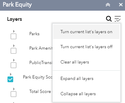 The Layer List widgets in the header at the top right allow you to switch layers. Layers are always drawn in order from top to bottom, and left to right, with the exception of the EJScreen context layers which will be drawn on top of any EJScreen layer. Keep in mind that the chart tool cannot be used while context layers are visible. Make sure to turn off all context layers before using the chart, either manually, or through the context menu's Clear All Layers button.To see layers in other groups, make sure to turn off any layers in the groups to the left of the desired layer. Viewing multiple layers at once is not recommended, as it makes it harder to visualize the data.
The context menu in the top right of each layer list allows you to turn all layers in the current list on or off, clear the layers of every list, and expand or collapse all the layers in the current list. Turning all of the layers of a layer list on at the same time is not recommended, as this can cause lists with many layers to fail to load. When a layer is turned on, it will automatically expand to show its legend. When it is turned off, the layer will be collapsed.
Accessing Block Group Data
Click on a block group to view the values of all the indicators in the top-most active layer for that block group. If you add a layer from a group that is higher in the drawing order while a block group is selected, it will automatically be re-selected in the new layer and and the info window will update to show the values of that group.
Tools
Select
![]() The select tool lets you draw a circle and select all of the block groups that at least partially fall inside. While you are drawing, the tool window shows the radius and area of the circle being drawn in miles and square miles. Once drawing is complete, the data for the selected features is automatically updated in the chart. To add more block groups to a selection, hold the shift key and draw a circle around them. Holding ctrl while selecting will remove block groups from the selection.
The select tool lets you draw a circle and select all of the block groups that at least partially fall inside. While you are drawing, the tool window shows the radius and area of the circle being drawn in miles and square miles. Once drawing is complete, the data for the selected features is automatically updated in the chart. To add more block groups to a selection, hold the shift key and draw a circle around them. Holding ctrl while selecting will remove block groups from the selection.
Chart
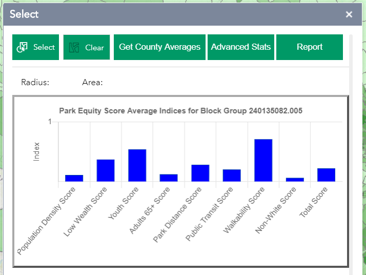 The chart helps you visualize the data. The default, simple chart shows the mean values for each indicator in the currently visible category for all selected block groups in a bar chart. If only one block group is selected,
the chart shows the actual values.
The chart helps you visualize the data. The default, simple chart shows the mean values for each indicator in the currently visible category for all selected block groups in a bar chart. If only one block group is selected,
the chart shows the actual values.
![]() Advanced Statistics
Advanced Statistics
The advanced statistics button switches the chart to a box-and-whiskers chart which lets you see the minimum, maximum, median, and 1st and 3rd quartiles. The box shows the range between the lowest 25% of values and the highest 25%. The middle line marks the median value. The top and bottom bars show the range of values that fall within 1.5 x the interquartile range. And data point above or below these values are considered outliers and are plotted as dots. Below the chart, these values, as well as the mean, range, and standard deviation, are listed for each indicator. Click on the labels below the chart to turn indicators on or off. If only one block group is selected, the advanced statistics will be the same as the simple.
![]() County Query
County Query
The "Get County Averages" button allows the user to view a chart showing statistics for an entire county. When a block group has been selected and this button is pressed, the app will automatically select every other census block group in the same county and update the chart with the new features. On the Simple Stats screen the chart will show the county data in red next to the selected feature's data. Click the button again to go back to viewing only the selected feature's data.
ReportThe Report tool creates a printable page showing the current map as well as a legend for the currently visible layer(s) and any selected feature. The chart and its data table will also be displayed on the printout, showing the number of selected features in each county as well as the mean value for each indicator in the layer. If the Report tool is called while the Advanced Statistics chart is displayed, these statistics will be shown on the report page as well.
 Print
Print
The Print tool creates a printable page showing the current map as well as a legend for the currently visible layer(s) and any selected feature. If multiple features have been selected, a table will also be displayed on the printout showing the number of selected features appearing in each county.
Side by Side Map Viewer
![]() This tool opens a new window with two identical maps of Maryland. Using the drop down menus, you can choose any two of the indicators from the app and compare them directly with each other. Any changes to the view of one map will automatically cause the other map to change to match.
This tool opens a new window with two identical maps of Maryland. Using the drop down menus, you can choose any two of the indicators from the app and compare them directly with each other. Any changes to the view of one map will automatically cause the other map to change to match.
In the settings window, you can change how the data is classified and the colors it is displayed in. To return to the main App, either close this tab or switch back to the other tab.
This project was developed with support from: Maryland Department of Natural Resources (MD DNR), the National Oceanic & Atmospheric Administration (NOAA), University of Maryland Center for Geospatial Information Science (CGIS), the National Center for Smart Growth (NCSG) and University of Maryland School of Public Health Community Engagement, Environmental Justice & Health (CEEJH) lab.